How well does your website perform on different device sizes?
Why does it matter?
Therefore it is important that your website looks great and works as expected responsively.
Responsive design is when a website is designed and developed in such a way that the website responds to the size of the visitor's device.
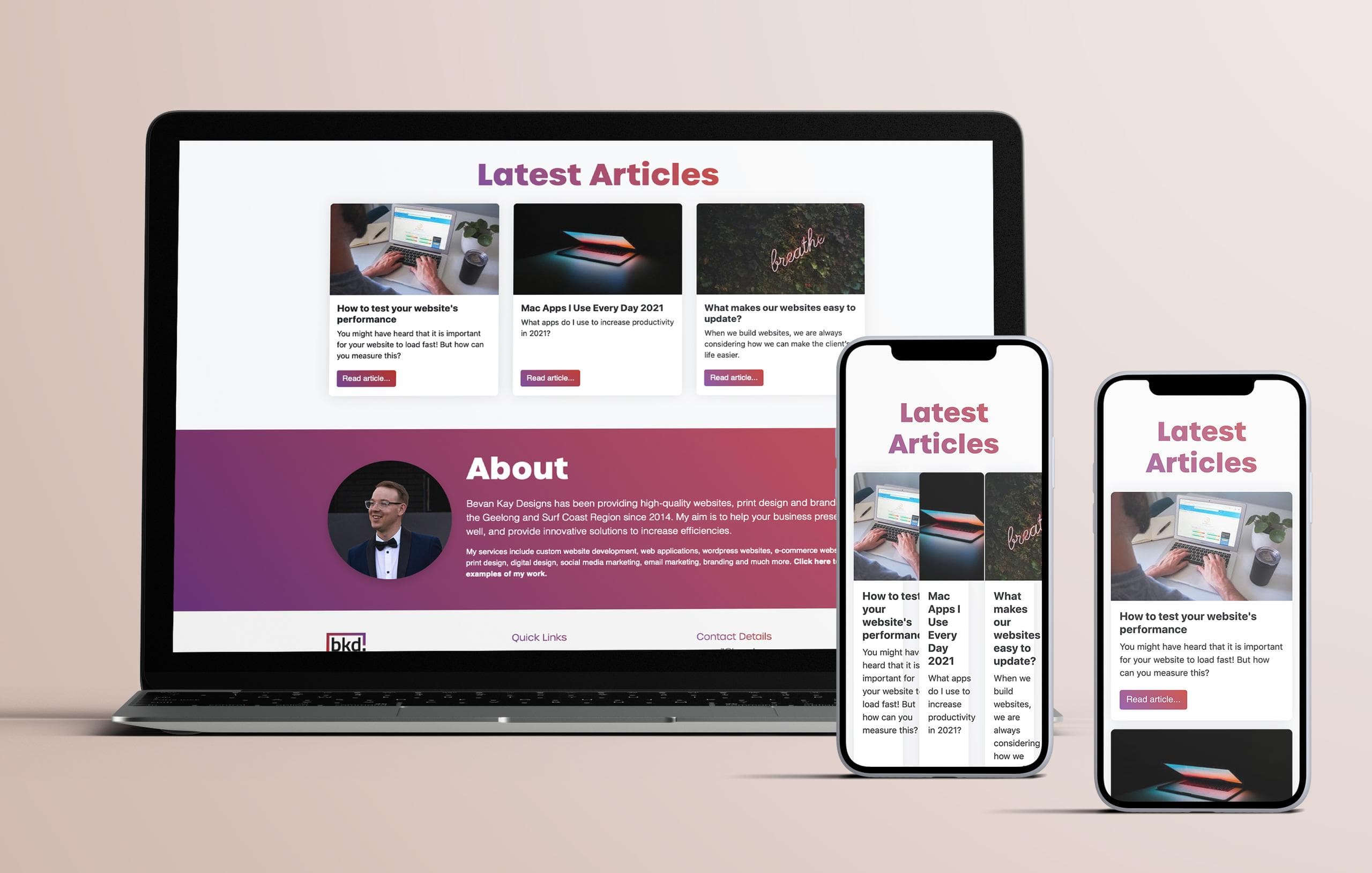
You may have a section on your website that has three columns and looks great on your laptop, however if it is still displayed with three columns on mobile it may not look good at all.
In the example below the website breaks entirely if there are three columns on mobile, but looks great again if we set it to only how with one column on smaller devices.

How can you test your website's responsiveness?
Ask friends to test it out
Not everybody has access to a wide variety of devices to test their website on, but you may have family or friends with access to different devices than you. In general, it is a good idea to ask others to take a look at your website because they may pick up on things that you have missed, and come in with fresh eyes and insight.
Dedicated desktop app
One of my favourite ways to test a website's responsiveness is using the ResponsivelyApp.
This is an app that you install on your computer, that then allows you to type in the URL and see it on a variety of website's next to each other. One of the best parts about the app is that it syncs the devices scrolling and navigation so that they are always looking at the same area of your website.
Best of all it is free.
Online responsiveness test
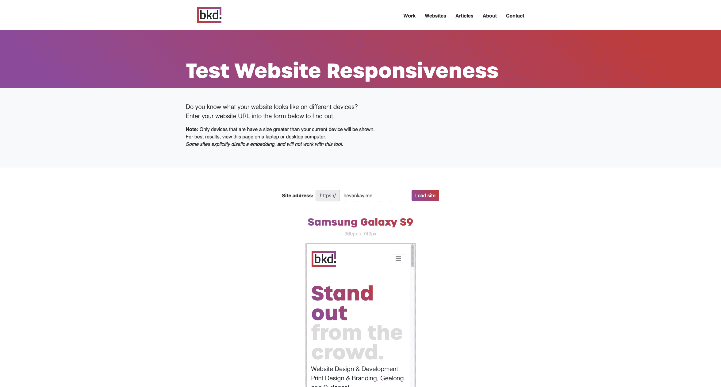
Bevan Kay Designs has developed an online tool to enable you to test what you website looks like on some common device sizes.
